
Dashboards show how things stand now. Trends shows how they got there: the share of your devices that was healthy on each day, so that you can see whether a problem is new, getting worse or already clearing.
There are two Trends pages, and everybody who can sign in can use both:
- Trends in the sidebar opens the original page: one chart for each of four health measures, by day or by month.
- Try the new Trends, in the banner at the top of that page, opens the new one: a score for each of five categories, then every policy and app on its own line, with a drill-down to the devices affected on any day.
Both are built from the history of issues. You see the trend for the devices your role allows.
The original Trends page#
Read the charts#
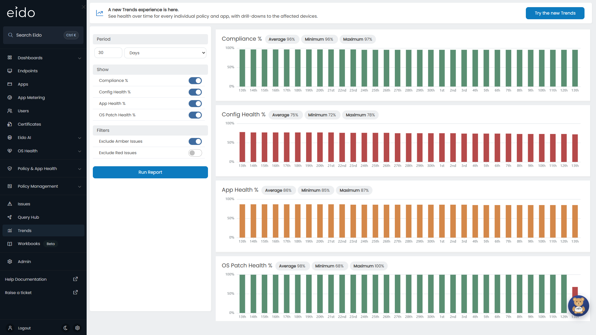
Each chart is one measure. Each bar is one day, or one month.
| Chart | The percentage of enrolled devices with |
|---|---|
| Compliance % | No open compliance issue |
| Config Health % | No open configuration issue |
| App Health % | No open app issue |
| OS Patch Health % | No open patch issue |
The colour of a bar follows its height:
| Colour | Healthy devices |
|---|---|
| Green | 90% or more |
| Amber | 80% up to 90% |
| Red | Below 80% |
Beside each chart’s title are the Average, Minimum and Maximum across the period. Hover over a bar for its exact figure.
Choose what is charted#
The panel on the left sets up the report. Changes to Intune Tenant, Period and Filters take effect when you press Run Report. The Show switches and the roll-up method apply at once.
| Setting | What it does |
|---|---|
| Intune Tenant | Limits the charts to the tenants you tick. Shown if your organisation manages several customers. All tenants are ticked to begin with. |
| Period | A number, and Days or Months. The page opens on 30 days. Choosing Months sets the number to 6, and choosing Days sets it back to 30. Change the number to look further back. |
| Monthly Data Roll-Up Method | Shown for Months. A month’s bar can be the Avg, the Min or the Max of its days. Use Min to see the worst day of each month. |
| Show | Switches each of the four charts on or off. |
| Exclude Amber Issues | On to begin with. Medium issues are ignored, so a device counts as unhealthy only if it has a High issue. |
| Exclude Red Issues | Off to begin with. Switch it on to ignore High issues. |
With Exclude Amber Issues on, the charts answer “how many devices have a serious problem”. Switch it off for the stricter question, “how many devices have any problem”.
Drill from a month into its days#
With Period set to Months, press a month’s bar. The chart changes to that month day by day, under the note “Drilling down into days for” and the month. Back to Monthly View returns to the months.
There is no further drill-down from a day on this page. For the devices behind a figure, use the new Trends page.
The new Trends page#
Press Try the new Trends on the banner. The page always covers the last 30 days.
How the score works#
A score is the share of devices that are healthy:
- For a policy or an app, it is the share of the devices it is assigned to that have no open issue for it.
- For a category, and for the patching and operating system measures, it is the share of all enrolled devices with no open issue of that kind.
A device with a Medium issue and a device with a High issue both count as unhealthy. There is no switch to leave one out. The two are always shown separately instead, as High and Medium counts and as red and amber on every chart, so you can read either from the same picture.
The category tiles#
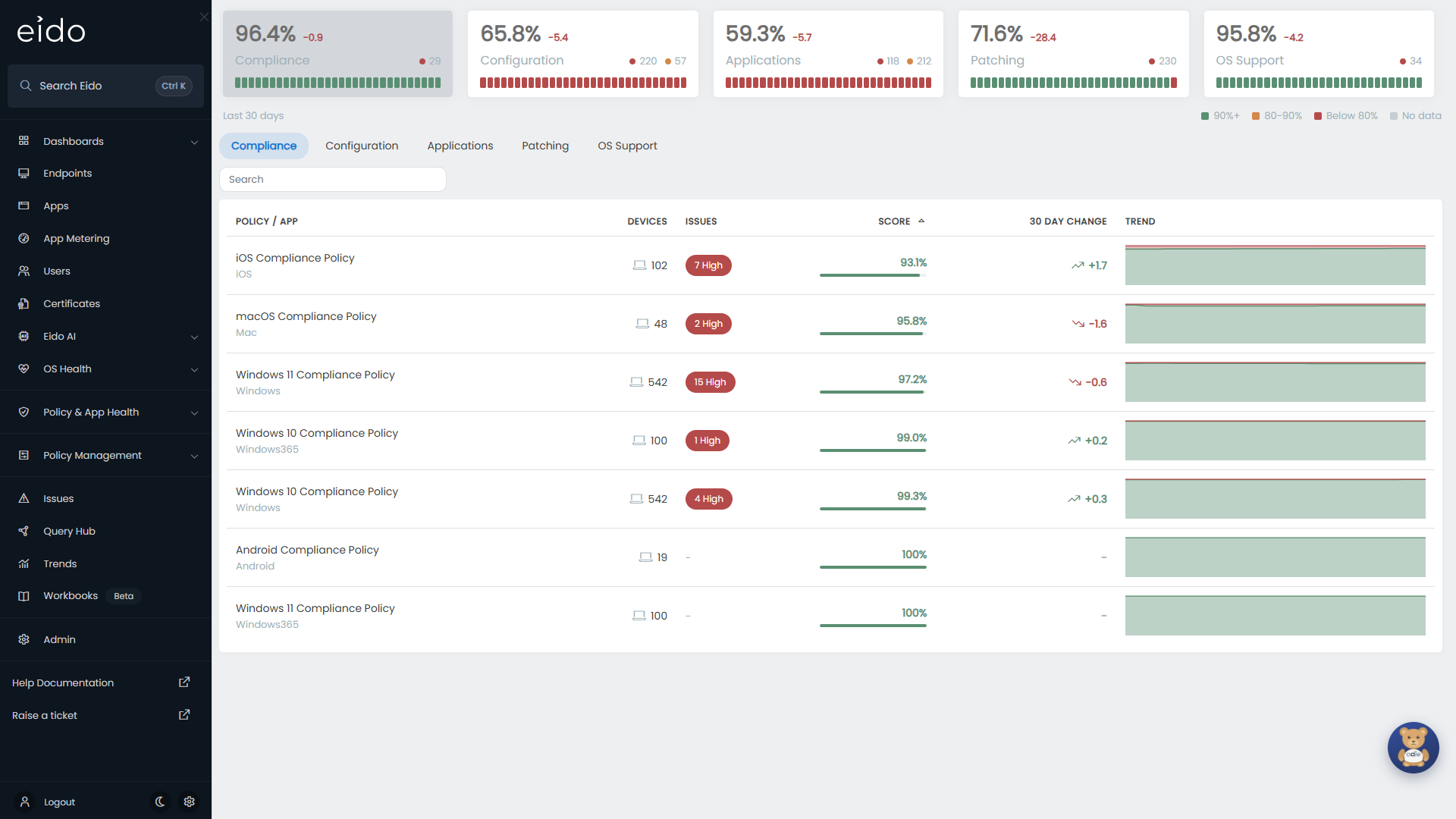
Five tiles run across the top: Compliance, Configuration, Applications, Patching and OS Support. Each shows:
- The score today.
- The change in the score over the 30 days, in points, with a plus or minus sign.
- A red dot and an amber dot with the number of devices that have High and Medium issues today.
- A strip of 30 segments, one for each day, coloured by that day’s score.
The key under the tiles gives the colours:
| Colour | Score that day |
|---|---|
| Green | 90%+ |
| Amber | 80-90% |
| Red | Below 80% |
| Faint | No data |
Hover over a segment for that day’s date, the High and Medium counts, how many devices were Healthy out of the total, and the Score. A day before Eido had any devices for you says No data collected.
Press a tile to show that category in the table below. The tabs under the tiles do the same.
The table of policies and apps#
Each tab lists everything in its category. It opens with the lowest score at the top.
| Column | What it holds |
|---|---|
| Policy / App | The name. Beneath it, the platform or policy type, or the publisher of an app. |
| Devices | The number of devices it is assigned to today. |
| Issues | Chips for the number of devices with High and Medium issues today. A dash if there are none. |
| Score | The score today, with a bar coloured green, amber or red on the same thresholds as the tiles. |
| 30 Day Change | The change in the score since the first day of the period, with an arrow up or down. A dash if it has not moved. |
| Trend | A small health band for the 30 days. Hover over it for any day’s figures. |
Press a column heading to sort by it, and again to reverse the order. Search narrows the list by name, platform or publisher.
The Patching tab has one line, Patch Status. The OS Support tab has two, OS Support Status and Major OS Compliance. All three are marked All enrolled devices, because they apply to every device and are not assigned like a policy.
A policy that is assigned to no devices today and raised no issues in the period is left out. A tab with nothing to show says “No data for this category in the selected period.”
Open one policy or app#
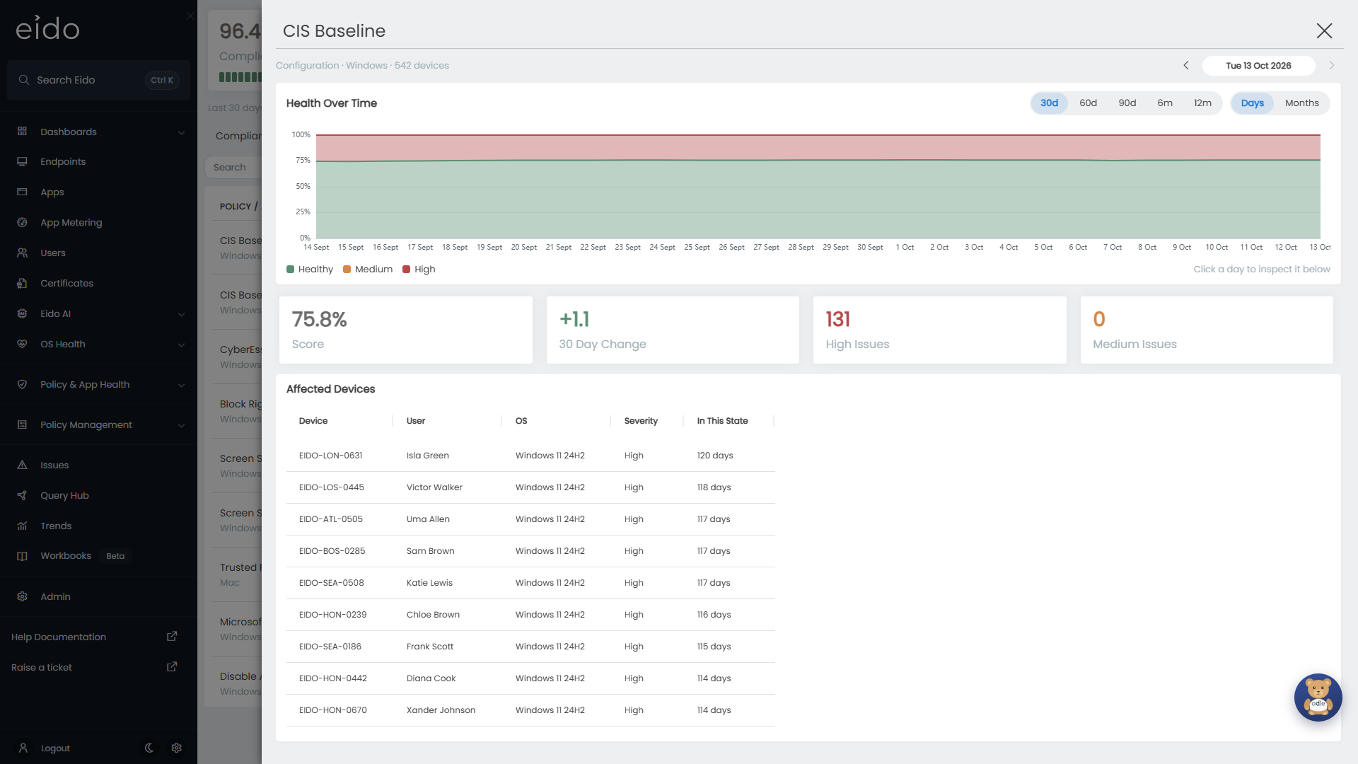
Press a row. A panel opens with the name at the top and, beneath it, the category, the platform and the number of devices.
Health Over Time
The chart is a health band. For each day it stacks the share of assigned devices that were:
- Healthy, in green at the bottom.
- Medium, in amber.
- High, in red at the top.
A wide green band is good. Amber or red eating into it from the top is devices falling out of health. Hover over any day for the counts and percentages.
| Control | What it does |
|---|---|
| 30d, 60d, 90d, 6m, 12m | How far back the chart goes. |
| Days, Months | One point for each day, or one for each month. A month is the average of its days. Choosing Months on a range shorter than six months widens the range to 6m. |
Policy change markers
A dashed vertical line with a diamond marks a day on which the policy was changed in Intune. Hover over that day and the tooltip adds what changed and who changed it:
- Policy created
- Settings changed
- Assignments changed
- Settings and assignments changed
- Policy deleted
This is the quickest way to tell whether a drop in health followed a change to the policy. Markers are shown for compliance and configuration policies, not for apps or the patching and operating system measures. The legend shows Policy change when the range holds at least one. For the changes themselves, see Intune changes.
Inspect one day
The panel always has one day selected. It starts on today.
- Press a day on the chart to select it. In Months, pressing a month selects its last day.
- Or use the arrows and the date box at the top right of the panel. They stay within the range the chart covers.
The four tiles under the chart then show that day’s Score, High Issues and Medium Issues, and the change in score since the start of the range. That tile is labelled 30 Day Change (or 60, 90 and so on) while today is selected, and Change to with the date when an earlier day is.
Affected Devices
The list at the bottom is the devices that had an issue with this policy or app on the selected day, High first, then by how long they have been in that state.
| Column | What it holds |
|---|---|
| Device | The device’s name. |
| User | Its primary user. |
| OS | Its operating system. |
| Severity | High or Medium. |
| In This State | How many days the device had been at that severity. |
Press a device to open its Device details. The list holds up to 500 devices. If there are more, a line beneath it says how many are shown out of the total. A day with none says “No affected devices on this day.”
Common questions#
Which Trends page should I use?#
Use the original page for a single figure for each measure over a long period, for example compliance month by month for a report. Use the new page to find which policy or app is behind a change, and which devices.
Why do the two pages give different percentages?#
They count differently. The original page ignores Medium issues unless you switch Exclude Amber Issues off. The new page always counts Medium and High. It also splits patching from operating system support, which the original page shows together as OS Patch Health %.
Why are there grey days at the start of a chart?#
Eido has no history from before it was connected to your tenant, or from before the policy was assigned to any device. Those days are shown as no data and are not scored.
Why are there no policy change markers?#
Either the policy was not changed in the range shown, or Eido AI is not switched on, or you are looking at an app or one of the patching measures, which have no markers.
Can I change the 30 days on the new page?#
Not on the page itself. Open a policy or app and choose a longer range in its panel, up to 12m.
Why did a policy’s score change when its issues did not?#
The score is a share of the devices the policy is assigned to. Assigning it to more healthy devices raises the score, and removing healthy devices lowers it, with the same devices failing.