
Once a query has a view, three things shape the answer: filters decide which rows are in, grouping decides whether you see the rows or a summary of them, and the visualisation decides what the summary looks like. All three are in the query builder, which Building a query introduces.
Nothing here changes until you press Preview.
Filters#
The Filters section shows how many filters the query has, such as Filters (2). Press the heading to fold the list away.
Add a filter#
-
Press the plus beside Filters
A new, empty row appears.
-
Choose a column
The list is grouped by subject, like the Columns panel, and has a search box. You can filter by a column whether or not the table is showing it.
-
Choose an operator
What is offered depends on the kind of column. See the tables below.
-
Give a value
A list to pick from, a box to type in, a date picker, or nothing at all, depending on the operator.
-
Press Preview
To remove a filter, press the bin at the end of its row.
How filters combine#
Every filter has to be true for a row to be included. There is no way to say “this filter or that one” between rows.
Within one filter, Equals takes several values and matches any of them. So “Device Manufacturer Equals Dell, HP” together with “Compliance Status Equals Unhealthy - High” finds Dell and HP devices that are also badly out of compliance.
A filter row with no value chosen is ignored, so a half-finished filter does not empty the results.
Text columns#
| Operator | Matches rows where the column |
|---|---|
| Equals | Is any of the values you tick. |
| Not Equals | Is none of the values you tick. Rows where the column is empty are left out as well. |
| Contains | Has your text somewhere in it. |
| Not Contains | Does not have your text in it. |
| Starts With | Begins with your text. |
| Ends With | Ends with your text. |
| Not Set | Is empty. |
For Equals and Not Equals, the list of values comes from the data: it shows the values that exist in rows matching your other filters. Columns with a fixed set of answers always offer the whole set, even when no row has that value today. The status columns are the main example: Healthy, Unhealthy - Medium, Unhealthy - High and Unknown.
Number columns#
Equals, Not Equals, Greater Than, Greater Than or Equal, Less Than and Less Than or Equal, each against one number you type.
Date columns#
Dates can be filtered relative to now, or against a fixed date.
| Operator | Value | Matches rows where the date is |
|---|---|---|
| In the Last | A number and a unit | Later than that long ago. “In the Last 7 Days” is anything from the past week. |
| More Than Ago | A number and a unit | Earlier than that long ago. “More Than Ago 30 Days” is anything older than 30 days. |
| In the Next | A number and a unit | Between now and that far ahead. |
| More Than From Now | A number and a unit | Later than that far ahead. |
| After, On or After | A date | Later than, or on or later than, the date. |
| Before, On or Before | A date | Earlier than, or on or earlier than, the date. |
| Not Set | None | Empty. |
The units are Hours, Days, Weeks and Months, and the number is a whole number of at least 1.
Relative filters are worked out each time the query runs. A saved report with “Intune Last Sync More Than Ago 30 Days” always shows devices that are stale today, which is what makes relative dates the right choice for reports, dashboards and scheduled emails. Fixed dates suit one-off questions about a particular period.
In the Next and More Than From Now are for dates that lie ahead, such as a warranty or certificate expiry.
True or false columns#
Is True, Is False and Is Null/Empty. None of them needs a value.
Version columns#
Greater Than or Equal and Less Than or Equal, against a version you pick from the versions present in the data. Versions are compared part by part as numbers, so 10.0.9 comes before 10.0.19045.
Entra groups#
On Devices and the views built on it, two extra filters let you narrow by group membership without the group being a column: Device Entra Group and Primary User Entra Group.
| Operator | Matches |
|---|---|
| Equals (any of) | Devices that are in, or whose primary user is in, at least one of the groups you pick. |
| Not Equals (any of) | Devices that are in none of them. |
Type into the value box to search groups by name. Membership includes nested groups.
The first time a group is used, Eido fetches its members from Microsoft, which can take up to a couple of minutes for a large group. After that the membership is remembered for a while and the filter is immediate. You cannot group by these two.
Filters with a padlock#
When you arrive in the builder through Open in QueryHub, the query may carry a filter the builder has no editor for, such as the single device you were looking at. It is shown with a padlock as plain text. It still applies, and you can remove it, but you cannot change it.
Grouping and aggregates#
Group By turns rows into a summary: one line per distinct value of the column you choose, with a figure for each. Any column you can filter by can be grouped by, apart from the Entra group filters. Clear Group By to go back to rows.
With Table selected you get a grouped table. With Bar Chart or Pie Chart you get a chart of the same figures.
Group by a date#
When the column is a date, a second list, by, sets the size of the bucket.
| Bucket | One line per |
|---|---|
| Distinct | Exact date and time. |
| Hour | Hour of the day, across all days. |
| Day of Week | Monday, Tuesday and so on, across all weeks. |
| Date | Calendar day. This is what a date column starts on. |
| Date & Hour | Hour of each day. |
| Month, Quarter, Year | Calendar month, quarter or year. |
Top#
Top limits the summary to the largest groups: 5, 10, 20, 50, 100 or All. It starts at 20. Everything that does not make the cut is added together into one line called Other, so the totals still add up.
“Largest” means by the first aggregation. Pressing Other opens a grouped table of what was folded into it.
Aggregations#
An aggregation is the figure worked out for each group. A grouped query starts with one, Count, the number of rows in the group.
| Function | Works on | Gives |
|---|---|---|
| Count | Nothing to choose | The number of rows. |
| Sum | Number columns | The total. |
| Avg | Number columns | The average. |
| Min, Max | Number and date columns | The smallest or largest, or the earliest or latest. |
| Distinct Count | Any column | How many different values there are. |
The box after as renames the figure. Left empty, it is named after what it is, such as “Sum(Total Installs)”.
A grouped table can have several aggregations: press the plus beside Aggregations to add one, and the cross on a row to remove it. Each becomes a column. A chart or a tile uses one, so switching from a table to a chart keeps only the first.
An empty value in the grouping column is shown as Unknown.
Order a grouped result#
Order By offers the grouping column and each aggregation. A grouped query starts sorted by the first aggregation, largest first. Column headings in a grouped table do not sort: use Order By and press Preview.
A grouped table is not paged. It shows every group Top allows.
Charts#
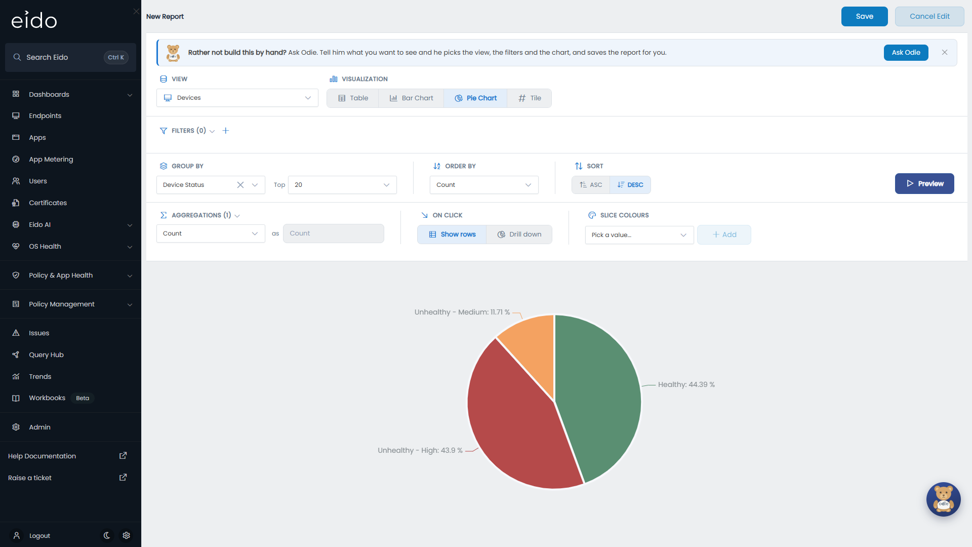
Bar Chart and Pie Chart both need a Group By. If you choose one without having set it, the builder picks a sensible column for you, which you can change. The height of a bar, or the size of a slice, is the first aggregation.
A pie labels each slice with its name and its share of the whole. Hover over a slice for the figure itself.
A few views can only be shown as a table or a tile. On those, the chart buttons are greyed out.
What a click does#
On click appears once the query is grouped, and applies to bars, slices and the rows of a grouped table.
| Setting | Pressing a group |
|---|---|
| Show rows | Opens a panel with the rows behind it. This is what a new query does. |
| Drill down | Opens the same kind of chart or grouped table, for that group only, grouped by the next column in your list. |
With Drill down selected, Drill into holds the list. Choose a column under Add level… and press Add. Add as many levels as you need: they are numbered in the order a click will follow them, and the cross on each removes it.
For example, a pie grouped by Primary User Country with levels Primary User Department and then Device Model lets somebody press a country to see its departments, press a department to see its models, and press a model to see the devices. After the last level a click shows the rows.
The panel that opens is titled with the column and the value that was pressed, and carries an Open in QueryHub button for taking those rows into the builder.
Slice colours#
By default Eido assigns colours to bars and slices itself. Slice colours, which appears for a grouped bar or pie chart, pins a colour to a particular value so that it is the same every time: green for “Healthy”, red for “Unhealthy - High”.
- Press Preview so that the builder knows which values exist.
- Under Slice colours, choose a value from Pick a value… and press Add.
- Press the coloured square beside the value and choose its colour.
- Repeat for each value that matters. Values you leave out keep their automatic colour.
If the query has not been previewed, the list is replaced by a box to type the value into. It has to match the value exactly, capitals included. The cross on a value removes its colour.
If you use Eido’s colour-accessible mode, standard red, amber and green are shown in their accessible equivalents. The chart and the coloured square both show the adjusted colour. Your chosen colour is what is saved.
Comparing each row with the rest#
Some of the most useful charts group by a label that depends on the rest of the data: is this device on the newest Windows build seen for its model, the one before, or older? A plain column cannot answer that, because the answer depends on other rows.
An administrator can add such a label as a computed column, using functions that look across the whole set of data: the highest, lowest, total or average of a column, optionally within a group, and a row’s rank. Group a chart by that column, pin green, amber and red to its values with Slice colours, and you have a traffic-light view of how far behind the estate is. See Computed columns.
Tiles#
A Tile is one number. It has no grouping or ordering, only filters and:
- Aggregation: Count for the number of matching rows, or Sum, Min, Max, Avg or Distinct Count of a column.
- Tile colour: a Base colour for the number, and Rules that change it depending on the value.
Each rule reads “When value”, a comparison (greater than, at least, less than, at most or equal to), a number and a colour. Rules are checked from the top and the first that matches wins. If none matches, the base colour is used. With no base colour the tile keeps Eido’s normal colour. The circular arrow beside the base colour clears it.
A tile for open high-severity issues might have a green base colour, a rule turning it amber when the value is greater than 0, and above that a rule turning it red when the value is greater than 10.
The caption under the number is the report’s name. Pressing a tile opens the rows it counted, unless the number is zero.
Tiles are mostly used on dashboards. See Building a dashboard.
Questions#
Why does my filter return nothing?#
Check for two filters that cannot both be true, since every filter has to match. Check Equals against a value that no longer exists in the data. And for dates, check the direction: In the Last looks back from now, In the Next looks ahead.
Why is a value missing from the Equals list?#
The list shows values present in the rows that match your other filters. Remove or loosen those and the value will appear.
Why do my Not Equals results leave out rows with no value?#
An empty column is neither equal nor unequal to anything, so Not Equals skips it. Add the empty rows back with a separate report filtered by Not Set.
Why is there a line called Other?#
Top is folding the smaller groups into it. Set Top to All to see every group on its own line.
Why are Bar Chart and Pie Chart greyed out?#
The view you are on supports only a table and a tile.
Why does the chart say “Run a preview to see grouped results”?#
Something changed since the last preview. Press Preview.
Why is my slice colour not being used?#
The value has to match exactly. “healthy” does not match “Healthy”. Preview the query and pick the value from the list rather than typing it.
Can I filter on a figure worked out by an aggregation?#
No. Filters apply to rows before they are grouped. To keep only the largest groups, use Top.